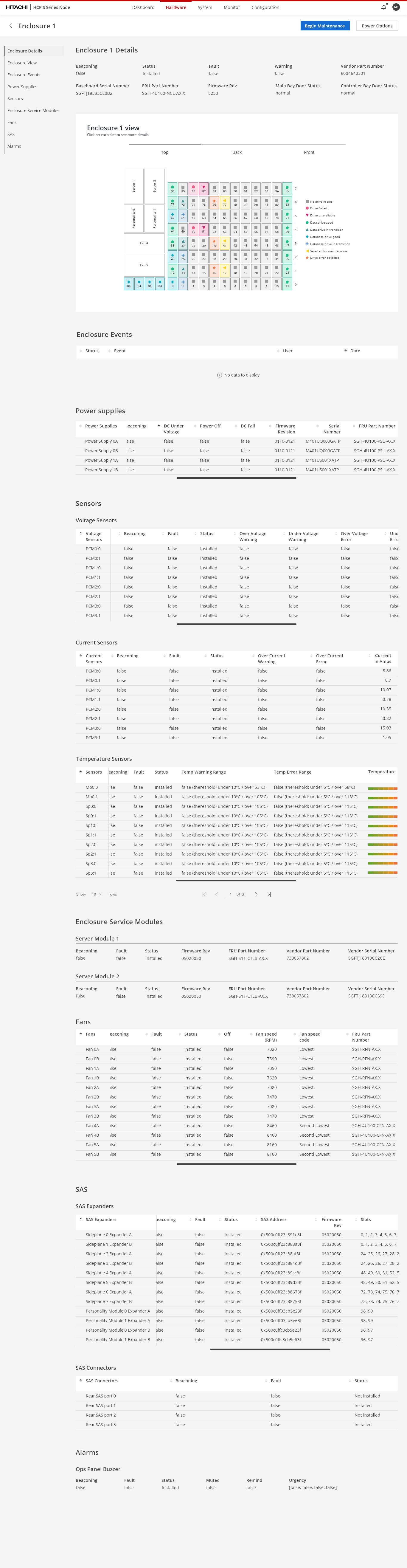
A note on these screens. The layouts and flows are the ones I designed. The styling is from the design system the product moved to later, which I worked on with the product design team when the company adopted it. The structure didn't change, only the surface did.
Content Platform S Nodes is an enterprise object-storage system dense enough to pack over a petabyte into a 4U chassis. Redundant server modules, power supplies, and commodity drives built for failure. The goal: make it fully customer-serviceable, so a failed part could be swapped on site without dispatching a Hitachi engineer. I designed that experience — setup through repair — from a blank page, and built much of the front-end that shipped it.
Every failed drive meant a field engineer in a car.
Field support engineers were stationed near our customers, but near could still mean a few hours of driving. For a real failure that trip made sense. For a dead hard drive it didn't, because swapping one is something an administrator can do in a few minutes, as long as they know which drive to pull.
That last part was the whole design problem.
Four things the flow had to do, in order.
There are 96 drive slots in a tray. Pull the wrong one and you've made the problem worse than it started. So we didn't design around the user getting it right. We gave them three separate ways to find the correct drive, then checked the work afterward and let them recover if it still went wrong.
Ninety-six slots, and you need exactly one of them.
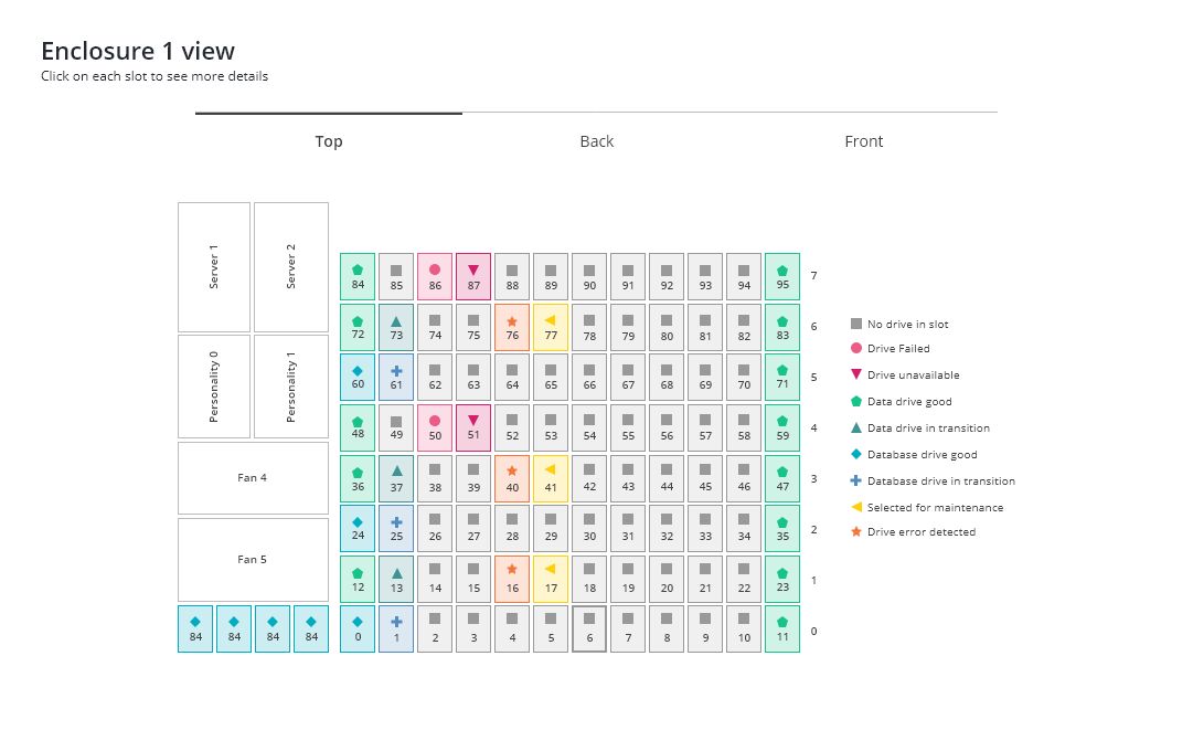
The enclosure view is a map of the actual machine. Top, back, and front, so it matches whichever side of the rack you're standing at. Servers, personality modules, fans and drive slots all sit where they physically sit, numbered the way they're numbered on the unit.
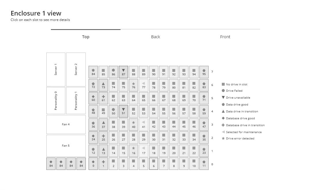
Nine states can show up in that grid, from a healthy data drive to one that's failed to one that's been selected for maintenance. Every one of them carries its own shape as well as its own color. Color never carries the meaning by itself.
We built it that way for two reasons, and both of them were requirements rather than nice-to-haves. Colorblind users had to be able to read every state, and we had people on the team who were colorblind and could tell us directly whether it worked. The sheet also had to survive being printed in black and white, because someone working a dark site is holding a printout and nothing else. Shape carries the full meaning in both cases.
Designed the whole experience, and the vocabulary under it.
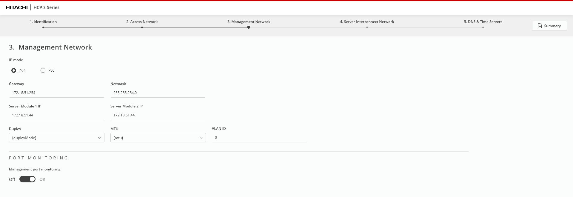
I designed every screen and worked the flows with the team, then took it further than most designers do: I shaped the API architecture and implemented most of the front-end that shipped. Setup, node health, and guided repair, all from scratch. Because there was nothing to copy, the real work was inventing the vocabulary: what each screen is, how an action reads, and what a healthy node looks like at a glance.
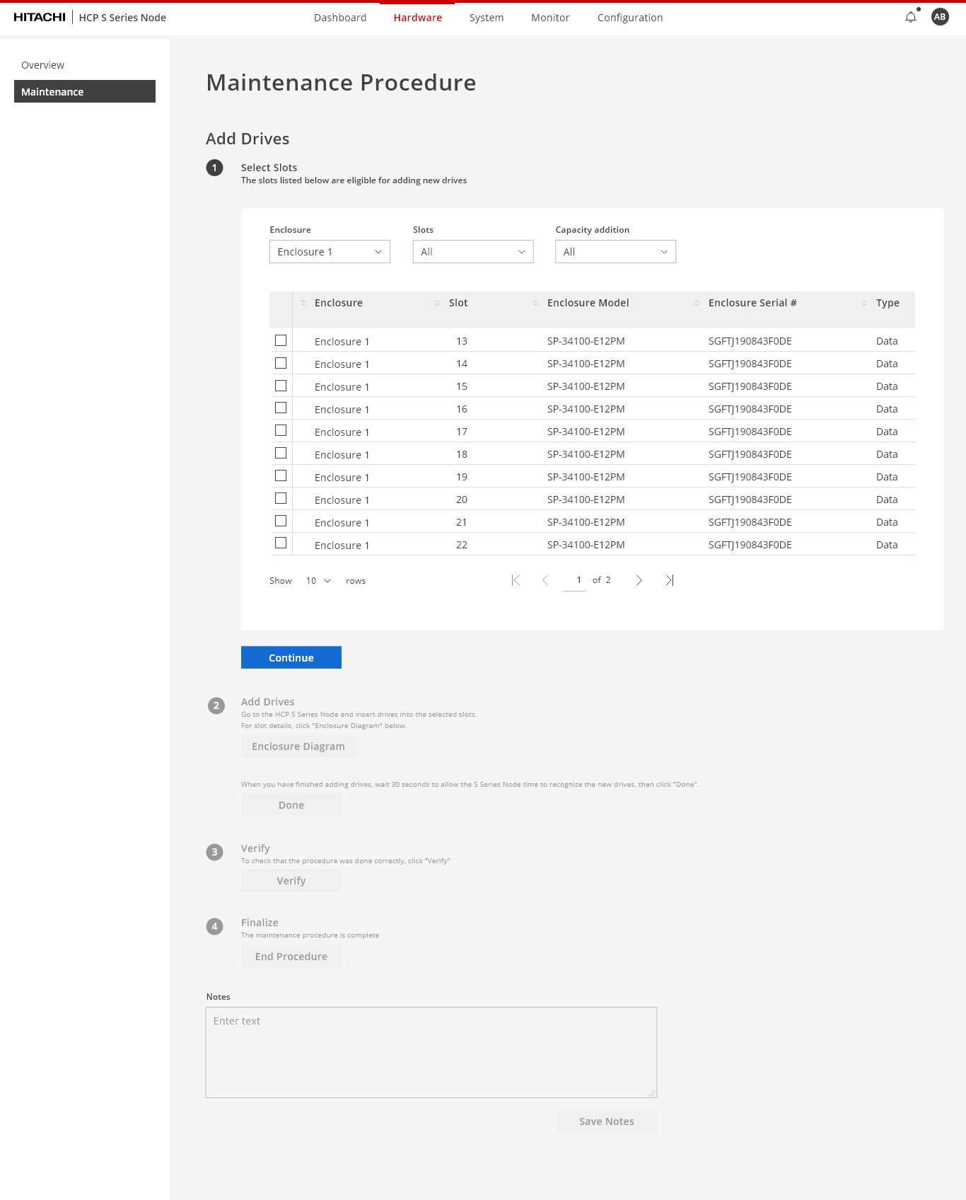
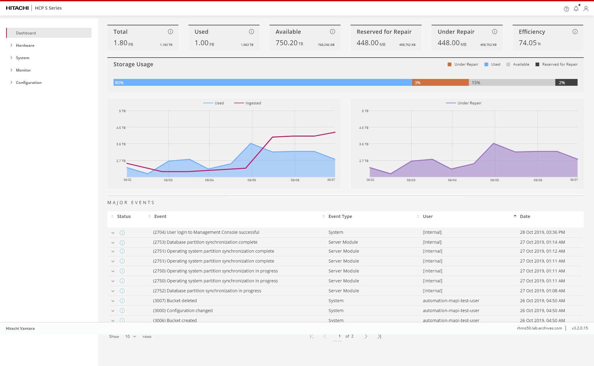
We tested on the actual machines, and found something nobody was looking for.
We recorded support engineers running the real procedures on real hardware. These were the experts, the people a customer calls when something has already gone wrong.
Two of them broke a physical part. Separately, and only because of how they removed and reinstalled it.
It didn't change the flow. It became a warning, bold and unmissable, about exactly what to do and why it mattered. The finding also went out as a bulletin to every support engineer, as a caution to customers, and back to the equipment manufacturer to fix at the source.
We went looking for usability problems in an interface and found one in the hardware.
Three things this product did before anything else at the company.
I designed every screen — then wrote most of the front-end that shipped them. Being able to build what I draw keeps the design honest.