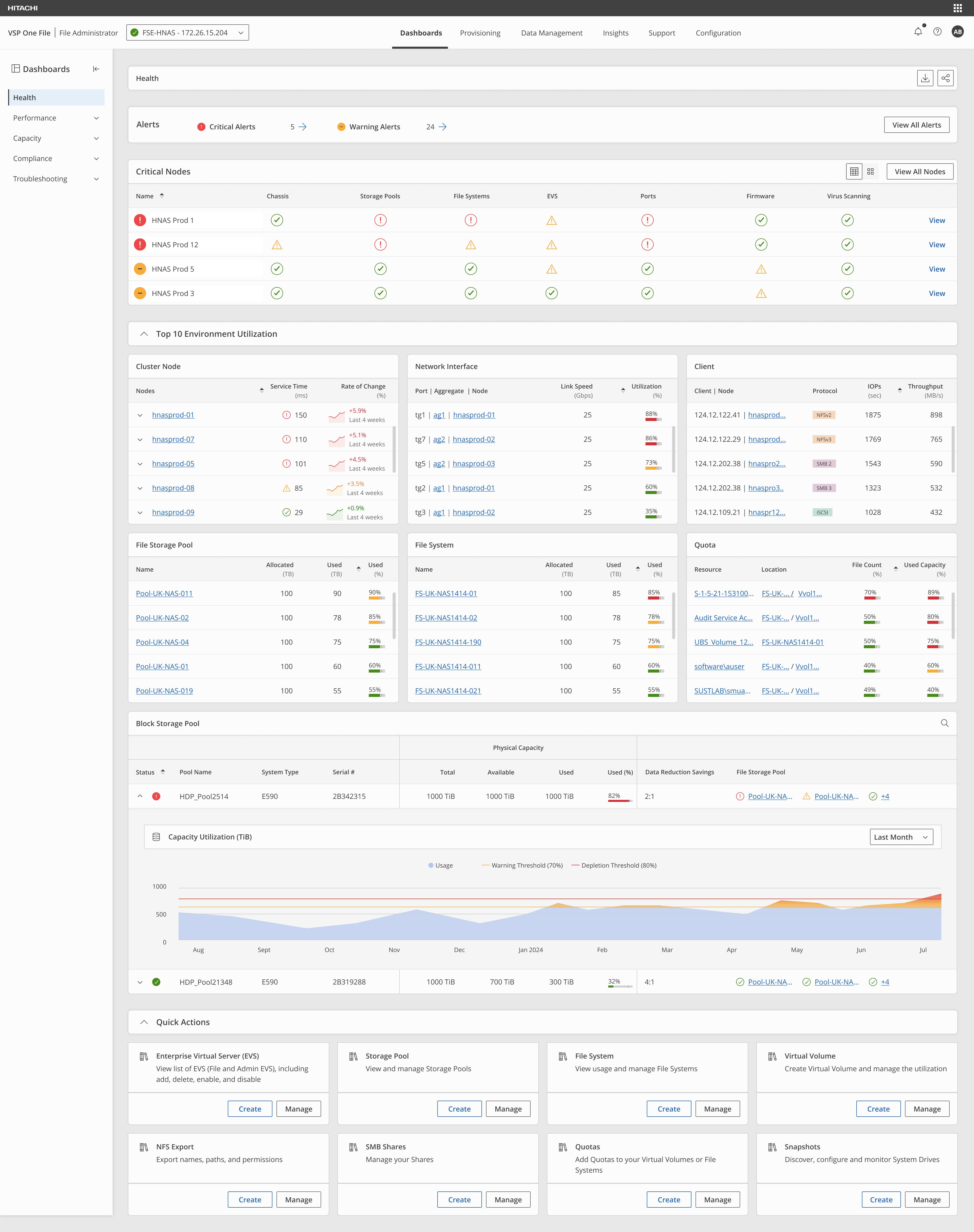
Virtual Storage Platform One File is Hitachi Vantara's enterprise file storage solution, formerly Hitachi NAS (HNAS) and rebranded as Hitachi folded its products under the VSP One name. It faced growing challenges meeting modern user expectations.
Our mission was to rebuild the management experience from the ground up.
When this started I was the only designer on it. I spent the first few months sitting with engineering leadership, gathering information and mapping workflows, before a second designer joined for the early research. What became a five-person team across six countries began as one person and a lot of questions.
A management experience unchanged for over a decade.
The application had grown organically for ten-plus years. Administrators fought unintuitive workflows, inefficient navigation, and complex, inconsistent layouts that actively hindered productivity.
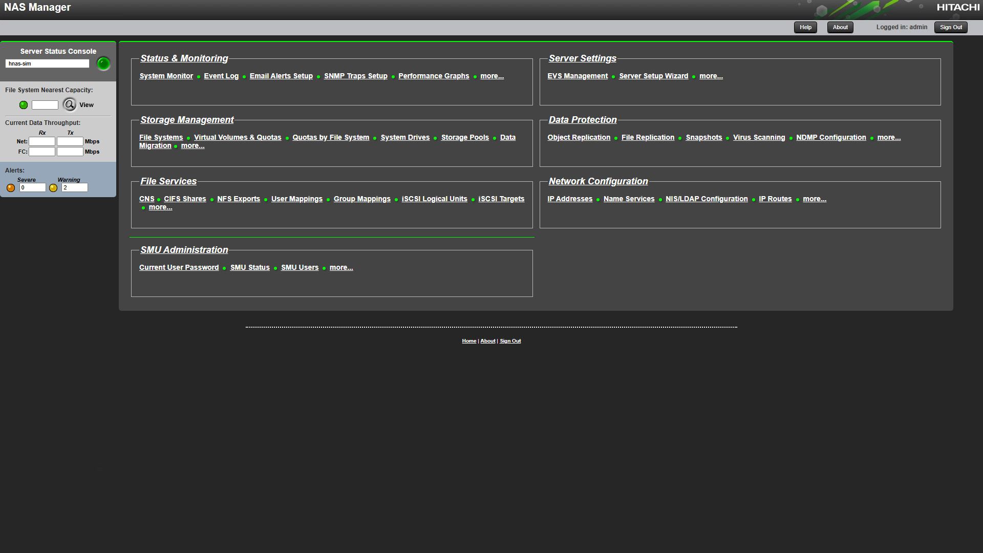
- Dated UI/UX, unchanged for a decade
- Unintuitive workflows causing friction
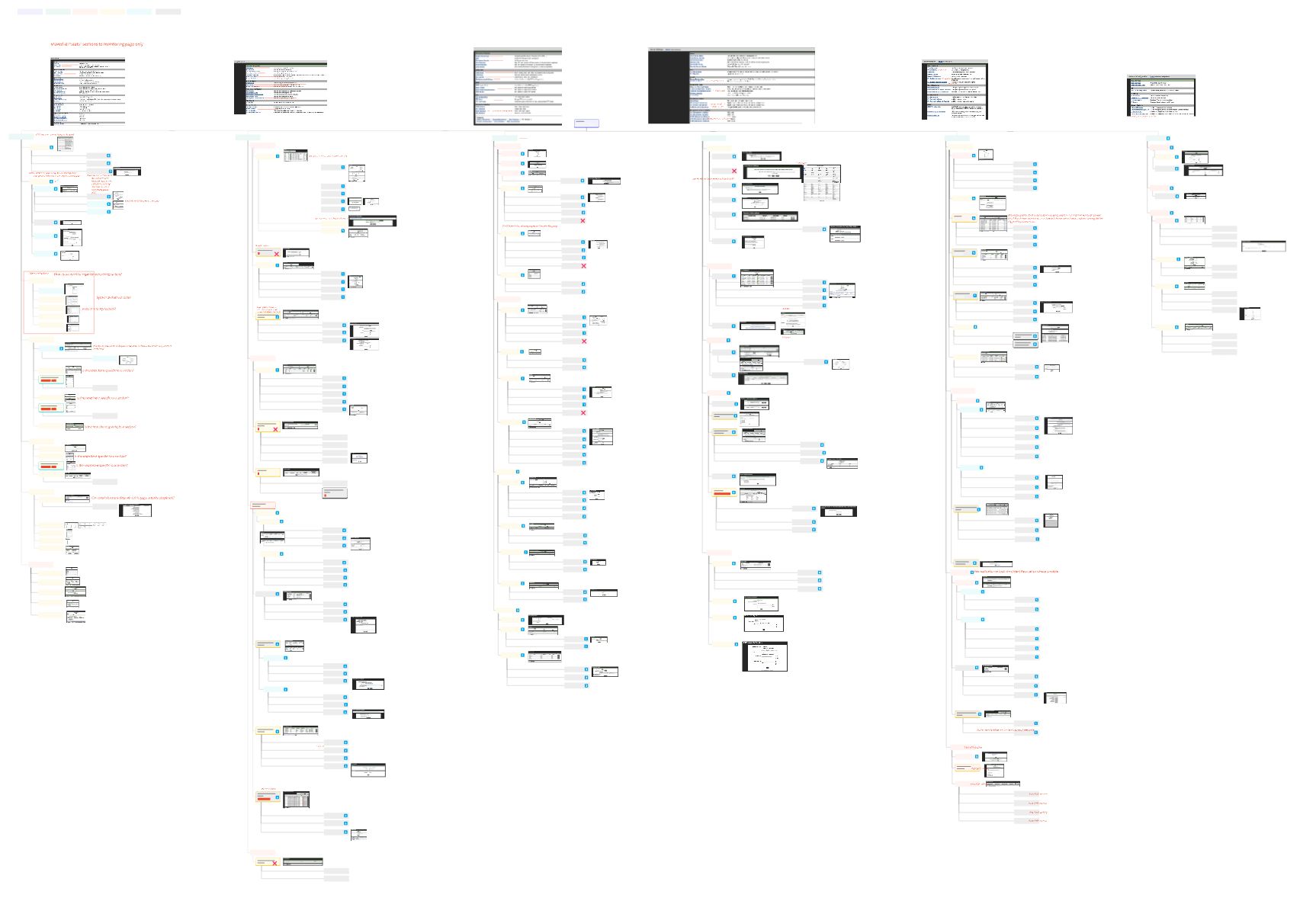
- Poor information architecture
- Excessively complex system structure
The information was already in the product, just never on the screen where you needed it.
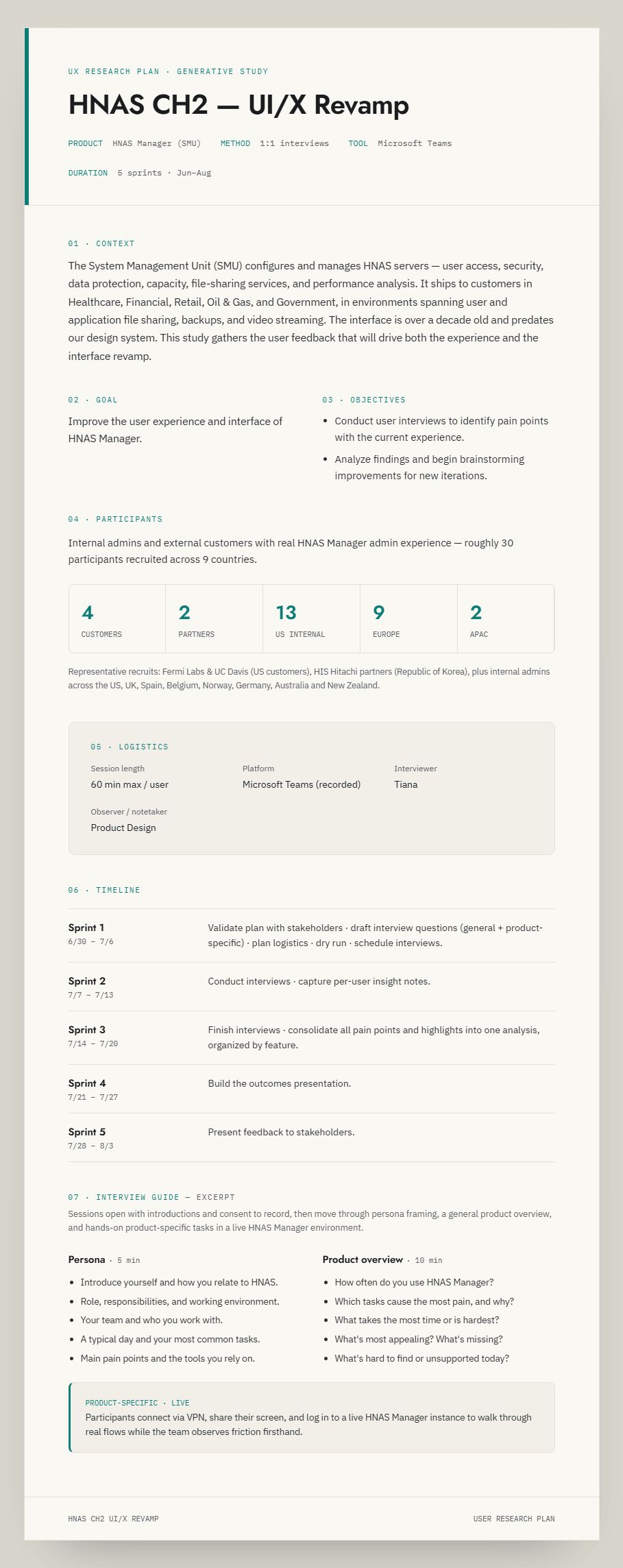
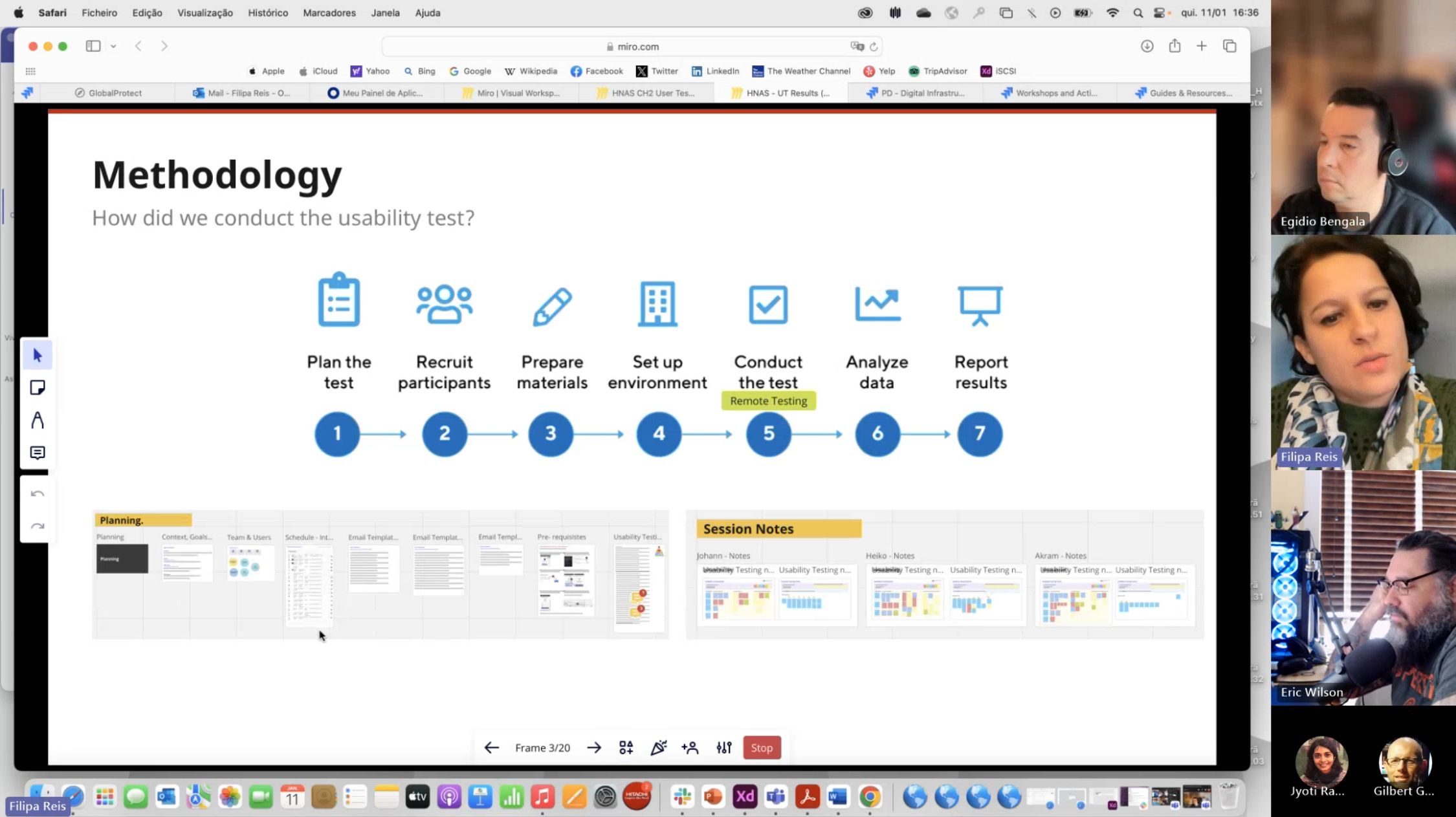
Before a single screen was drawn, we ran generative research with storage administrators, then validated the redesign with task-based usability testing on working prototypes.
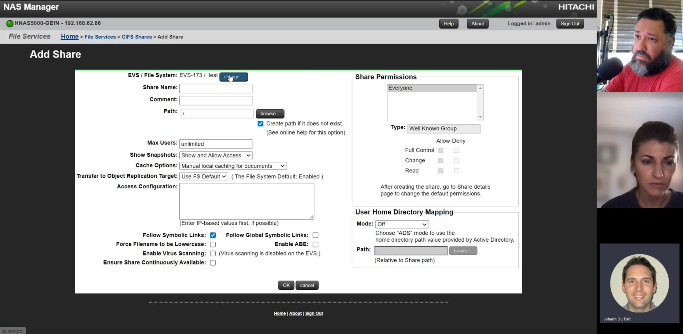
“A lot of the information is in here — it’s just not on the screen where you’d actually find it useful. You have to go to completely different areas to get it.”
— ESCALATION ENGINEER, GLOBAL SUPPORT · RESEARCH INTERVIEW
We mapped the existing product before deciding what to redesign.
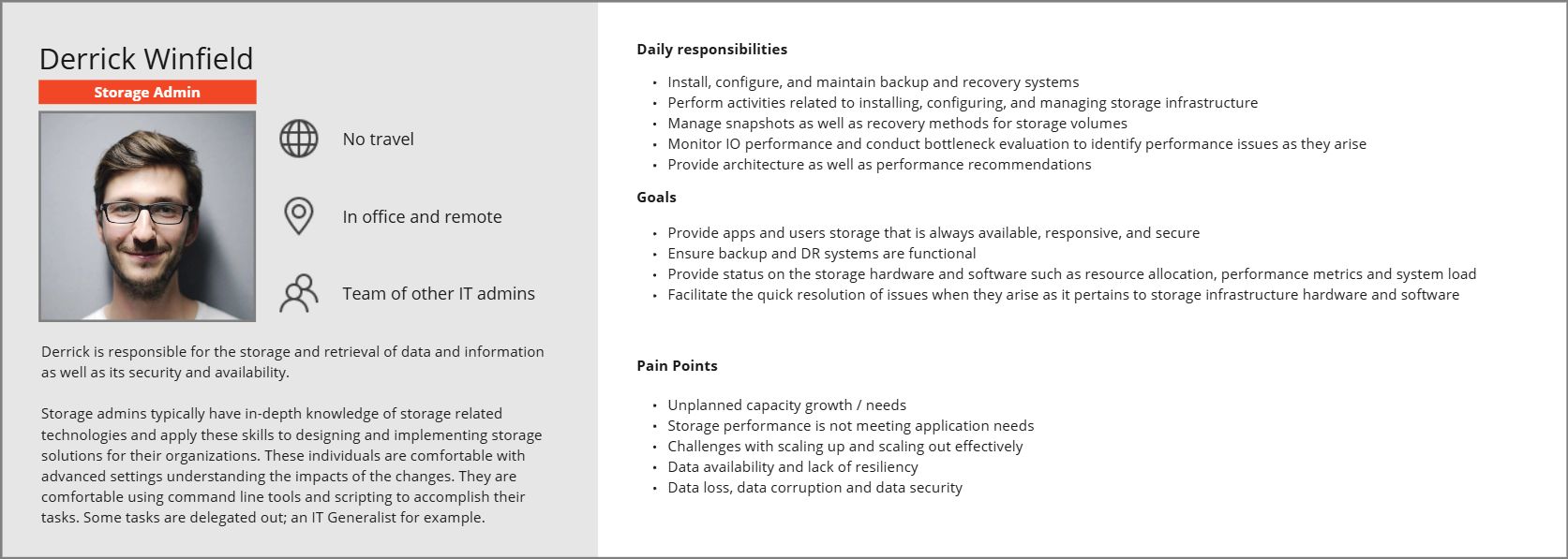
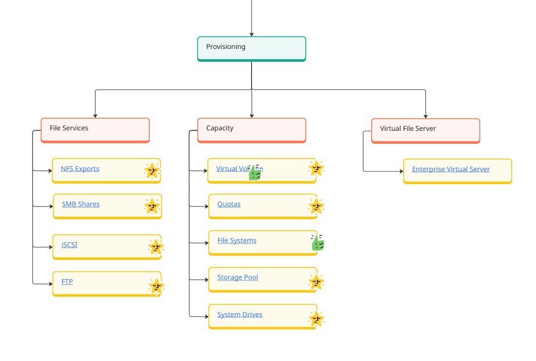
We mapped the existing application, analyzed critical workflows, defined personas from real interviews, and aligned stakeholders in an in-person workshop before a single screen was designed.
Five days, one room, the whole product on the wall.
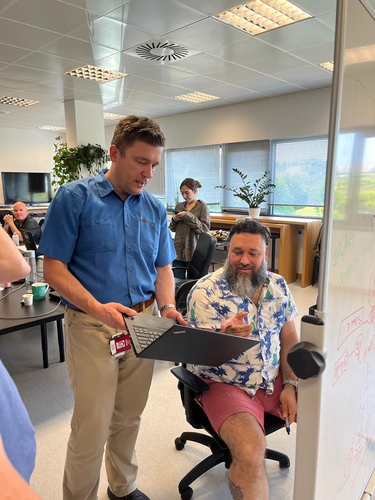
I ran a week-long design-thinking workshop at Hitachi’s Lisbon office: 20+ in the room spanning business, engineering, customer-facing, usability, and design, on-site and remote. We split the problem into two tracks and worked each end to end: proactive system status, monitoring & reporting and reactive troubleshooting, triage & resolution.
- 01Empathize — grounded the room in two personas: the multitasking IT Generalist and the Field Support Engineer.
- 02Define — captured the as-is journeys and ran a fishbone deep-dive to surface root-cause pain.
- 03Ideate — brainstormed solutions, then mapped the end-to-end to-be story per use case.
- 04Prototype — whiteboarded wireframes straight off the user journeys, iterating live with stakeholders.
- Aligned problem statements across business, engineering, and design — one shared source of truth.
- Feature mapping & prioritization — every idea sorted into MVP, MVP+, Doc, or Backlog.
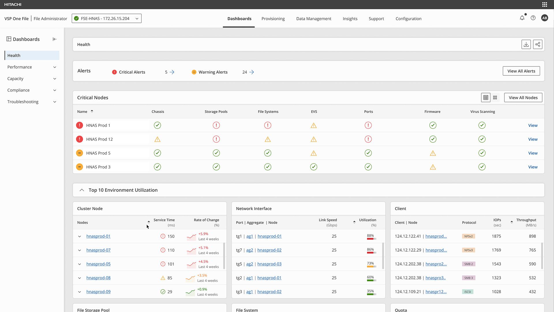
- Four new dashboards — Health/Home, Performance, Capacity, and Troubleshooting.
- The Smart Provisioning Flow — the guided journey that replaced steps scattered across the platform.
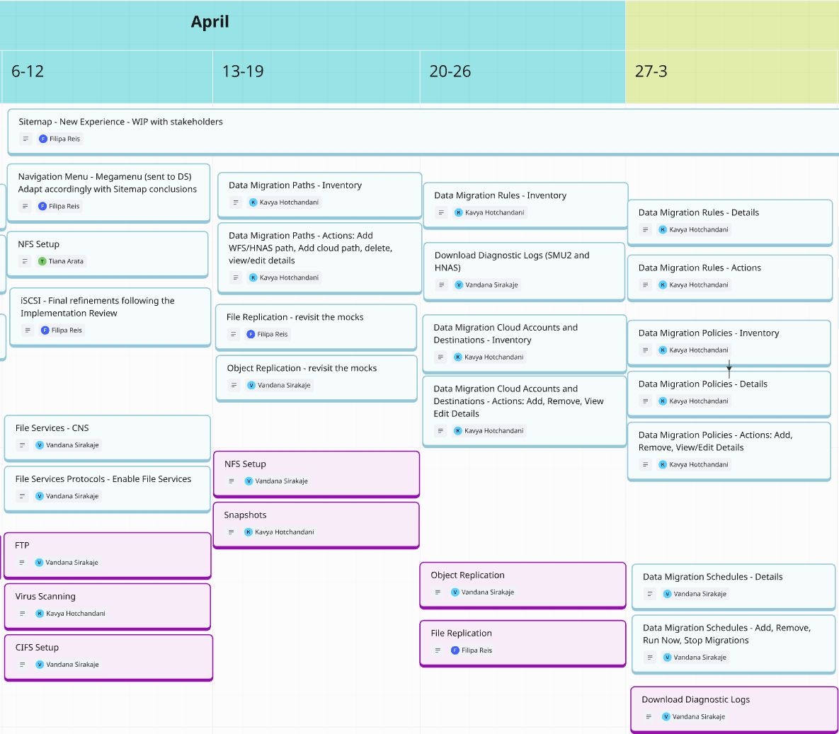
Out of the workshop’s action plan, I owned the navigation restructure, the File & Object Replication updates, and the new provisioning flow, from mockup through prototype. The room’s alignment carried directly into shipped design.
Clearer navigation, guided workflows, and one shared design system.
A task that needed an expert, turned into a guided sequence.
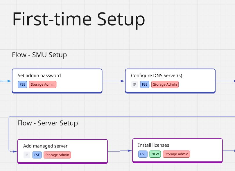
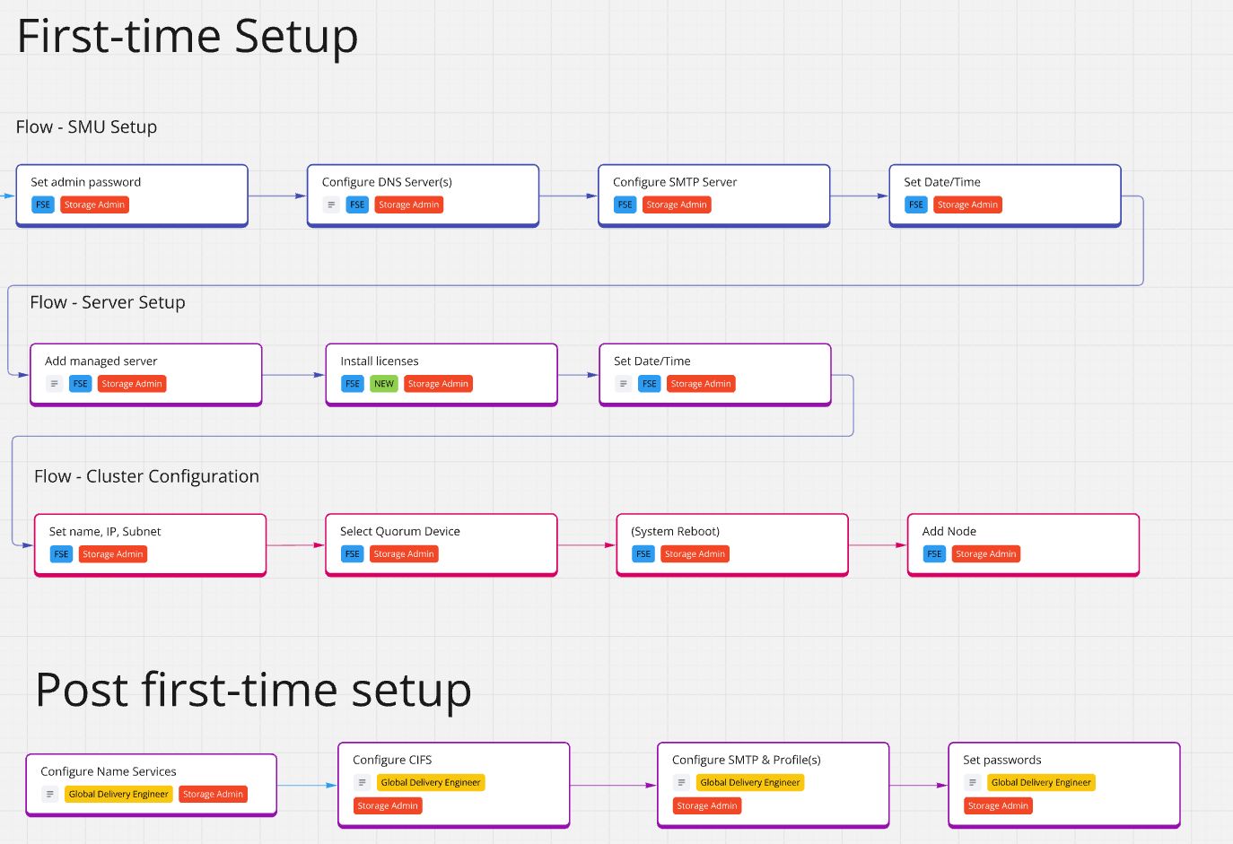
First-time setup once demanded tribal knowledge and a support call. We broke it into a clear, in-product path a new administrator can complete with confidence, surfacing the right information at each step.
Set the admin password, DNS, and time — validated inline before moving on.
Add the managed server and licenses with role-aware guidance for each field.
Name, IP, quorum and nodes — sequenced so a reboot never leaves you lost.
Confirm health at a glance, then hand off to day-to-day management.
One navigation system, three registers.
Wayfinding at three scales: a persistent global header for the whole app, a megamenu for fast jumps into nested pages, and a collapsible left rail that adapts to the current view.
Each header section expands into a categorized megamenu, so admins reach deep pages in one move instead of drilling level by level.
A collapsible rail that changes with context, surfacing only the sub-navigation relevant to where you are.
A decade of one-off screens replaced with shared components, tokens, and patterns.
Craft stopped depending on any single designer in the room, and the team shipped faster with fewer inconsistencies.
What changed, and why.
Hover a highlighted region, or a chip above, to see what changed and why.
Twelve moderated sessions, from first-time users to administrators running 250+ deployments.
Twelve moderated usability sessions with HNAS administrators, pre-sales engineers, and solution architects. Some had managed more than 250 deployments; others were seeing the product for the first time. The redesign validated where it counted, and the sessions handed us a ranked backlog for the next iteration.
- The guided setup wizard
Every participant praised it: “the onboarding of the server is really made easy”; another set up a full cluster and said simply, “that was really quick.” The flagship workflow held up unaided.
- Speed & responsiveness
The modern UI reversed the “it must be slow” assumption the legacy look created: “it’s fast, it’s responsive, not as bad as they think.”
- Industry-standard language
Relabeling to SMB / NFS and familiar terms landed cleanly, even for admins arriving from competing platforms.
- Commit affordance on “Add”
Users could advance without noticing a field needed an explicit Add. Fix: clearer required-state and commit feedback per section.
- Persist working context
The new UI forgot the selected EVS / file system between sections where the legacy tool remembered it. Fix: carry the active object across navigation.
- Discoverability of setup entry
The SMB-setup / configuration entry point wasn’t obvious. Fix: surface it in context, alongside the object it configures.
Every finding above became a prioritized ticket. Publishing the ones that didn’t land is how a design org earns trust.
Beyond the product, the biggest win was the team: over 3 years, designers grew from executing tickets to shaping strategy and becoming stronger partners in the product process.
See how I lead teams →